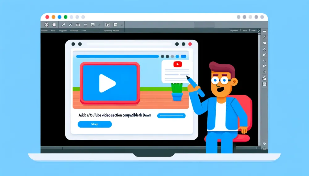
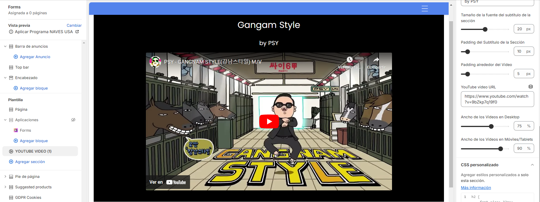
Incorpora una sección con un video de Youtube a tu Tema Shopify (compatible con Dawn)
En este post encontrarás el paso a paso para agregar una nueva sección con un video de Youtube a tu tema en Shopify.
Si bien Dawn trae un componente de video, este no tiene muchas opciones, por ejemplo para adaptar el tamaño del video, o agregarle un título o un subtítulo, por lo que no resuelve bien la necesidad de mostrar videos de Youtube de distintas tiendas online.
Al diseñar esta nueva sección de video, tuvimos en mente los siguientes requerimientos:
- Permitir agregar videos con la URL del video en youtube (por ejemplo
https://www.youtube.com/watch?v=9bZkp7q19f0, dondewatch?v=9bZkp7q19f0indica el video que utilizaremos en nuestra sección. - Contar con un título y subtítulo.
- Permitir ajustar la dimensión del video en distintas resoluciones (ejemplo: desktop, móvil).
- Permitir ajustar tamaños y colores de textos, color de fondo del video, imagen de fondo del video y espacios (padding) de los distintos elementos.
Vamos viendo y explicando las distintas partes del código, al final encontrarás el código completo.
<div class="MD-video-section">
    <div class="MD-video-container">
        <div class="MD-video">
            <iframe src="https://www.youtube.com/embed/{{ videoId }}" allowfullscreen></iframe>
        </div>
    </div>
</div>
Este es el HTML básico, donde creamos un div para la sección, un div para el contenedor del video y un div para el video, a este código luego le agregaremos los distintos parámetros para ajustar los estilos según se configuré en el editor de temas de Shopify. El parámetro videoID veremos un poco más adelante como se obtiene.
{% schema %}
{
  "name": "YOUTUBE VIDEO (1)",
  "class": "section section-video-section",
  "tag": "section",
  "settings": [
    {
      "type": "checkbox",
      "id": "full_width",
      "label": "Usar ancho completo",
      "default": false
    },
    {
      "type": "range",
      "id": "section_margin_top",
      "label": "Relleno superior",
      "min": 0,
      "max": 100,
      "step": 1,
      "default": 20,
      "unit": "px"
    },
    {
      "type": "range",
      "id": "section_margin_bottom",
      "label": "Relleno inferior",
      "min": 0,
      "max": 100,
      "step": 1,
      "default": 20,
      "unit": "px"
    },
    {
      "type": "color",
      "id": "background_color",
      "label": "Color de Fondo",
      "default": "#af54ff"
    },
    {
      "type": "checkbox",
      "id": "use_background_image",
      "label": "Usar imagen de fondo",
      "default": false
    },
    {
      "type": "image_picker",
      "id": "background_image",
      "label": "Imagen de Fondo"
    },
    {
      "type": "color",
      "id": "font_color",
      "label": "Color del texto",
      "default": "#ffffff"
    },
    {
      "type": "range",
      "id": "section_padding",
      "label": "Padding de la Sección",
      "min": 0,
      "max": 100,
      "step": 1,
      "default": 20,
      "unit": "px"
    },
    {
      "type": "text",
      "id": "title",
      "label": "Título",
      "default": "Tu Título"
    },
    {
      "type": "range",
      "id": "section_title_fontsize",
      "label": "Tamaño de la fuente del título de la sección",
      "min": 10,
      "max": 50,
      "step": 1,
      "default": 30,
      "unit": "px"
    },
    {
      "type": "range",
      "id": "title_padding",
      "label": "Padding del Título de la Sección",
      "min": 0,
      "max": 100,
      "step": 1,
      "default": 20,
      "unit": "px"
    },
    {
      "type": "text",
      "id": "subtitle",
      "label": "Subtítulo",
      "default": "Texto Adicional"
    },
    {
      "type": "range",
      "id": "section_subtitle_fontsize",
      "label": "Tamaño de la fuente del subtítulo de la sección",
      "min": 10,
      "max": 30,
      "step": 1,
      "default": 20,
      "unit": "px"
    },
    {
      "type": "range",
      "id": "subtitle_padding",
      "label": "Padding del Subtítulo de la Sección",
      "min": 0,
      "max": 100,
      "step": 1,
      "default": 10,
      "unit": "px"
    },
    {
      "type": "range",
        "id": "video_padding",
        "label": "Padding alrededor del Video",
        "min": 0,
        "max": 50,
        "step": 1,
        "default": 10,
        "unit": "px"
    },
    {
      "type": "text",
      "id": "video_url",
      "label": "YouTube video URL",
      "default": "https://www.youtube.com/watch?v=QoYzybtjrmA"
    },
    {
      "type": "range",
      "id": "video_width_desktop",
      "label": "Ancho de los Videos en Desktop",
      "min": 30,
      "max": 100,
      "step": 1,
      "default": 50,
      "unit": "%"
    },
    {
      "type": "range",
      "id": "video_width_mobile",
      "label": "Ancho de los Videos en Móviles/Tablets",
      "min": 30,
      "max": 100,
      "step": 1,
      "default": 90,
      "unit": "%"
    }
  ],
  "presets": [
    {
      "name": "YOUTUBE VIDEO por Mente Digital"
    }
  ]
}
{% endschema %}
Este es el schema de la sección, incluye todo lo que vemos luego en el editor de temas de Shopify para ajustar las distintas partes y componentes de nuestra sección de video Youtube.
<style>
.MD-video-section.full-width {
    max-width: none;
    width: 100%;
}

.MD-video-section {
    text-align: center;
    max-width: 1200px;
    margin: auto;
    background-size: cover;
    background-repeat: no-repeat;
    background-position: center center;
}

.MD-video-section-hMDder h2,
.MD-video-section-hMDder h3 {
    margin: 0;
    padding: 0.5em 0;
}

.MD-video-container {
    display: flex;
    flex-wrap: wrap;
    justify-content: space-around;
    gap: 20px;
}

.MD-video {
    flex-basis: calc({{ section.settings.video_width_desktop }}% - 10px);
    box-sizing: border-box;
    margin: 0 auto;
}

.MD-video iframe {
    width: 100%;
    height: auto;
}

.MD-video h2, .MD-video h3 {
    margin: 0.1em 0;
    text-align: center;
}

/* Ajustes para tabletas */
@media (max-width: 768px) {
    .MD-video {
        flex-basis: auto;
        margin: 0 auto;
    }
}

/* Ajustes para móviles */
@media (max-width: 480px) {
    .MD-video {
        width: {{ section.settings.video_width_mobile }}%;
        flex-basis: auto;
        margin: 0 auto;
    }
}
</style>
Este es el código CSS, utiliza varios componentes que se setean en el editor de temas, este código incluye las consideraciones para que se comporte adecuadamente en distintos tamaños de pantalla y dispositivos (es responsive).
{% assign videoUrlParts = section.settings.video_url | split: "v=" %}
{% assign videoId = videoUrlParts[1] | split: "&" %}
{% assign shortUrlParts = section.settings.video_url | split: "youtu.be/" %}
{% if videoId[0] %}
  {% assign videoId = videoId[0] %}
{% elsif shortUrlParts[1] %}
  {% assign videoId = shortUrlParts[1] %}
{% endif %}
Este código nos permite obtener el ID del video en youtube, https://www.youtube.com/watch?v=ID_VIDEO, el que luego usaremos en un iframe para desplegar el video en nuestra tienda, reemplazando el valor de videoID en nuestro código.
Ahora veremos un pequeño truco para mantener la relación de aspecto del video en 16:9, aunque ajustemos el tamaños del video para desktop o para móviles, esto además funciona cuando se cambian estos parámetros en el editor de tema ya que escucha los eventos shopify:section:select, shopify:section:update y shopify:section:load, lo que nos permite ir visualizando como quedaría la sección al hacer cambios sin necesidad de guardar la sección.
<script>
document.addEventListener("DOMContentLoaded", function() {
  adjustVideoAspectRatios();
  window.addEventListener('resize', adjustVideoAspectRatios);

  document.addEventListener('shopify:section:select', adjustVideoAspectRatios);
  document.addEventListener('shopify:section:update', adjustVideoAspectRatios);
  document.addEventListener('shopify:section:load', adjustVideoAspectRatios);
});

function adjustVideoAspectRatios() {
  const videoContainers = document.querySelectorAll('.MD-video');
  videoContainers.forEach(container => {
    const iframe = container.querySelector('iframe');
    let width = iframe.offsetWidth;
    let height = width * (9 / 16); // Para una relación de aspecto de 16:9
    iframe.style.height = `${height}px`;
  });
}
</script>
Finalmente, mostraremos nuevamente la sección con todos los settings que incorporamos al schema agregados, de esta forma podemos administrar completamente el look&feel y el contenido de esta sección desde el editor de temas:
<div class="MD-video-section{% if section.settings.full_width %} full-width{% endif %}"
style="color: {{ section.settings.font_color }}; background-color: {{ section.settings.background_color }};
{% if section.settings.use_background_image %} background-image: url('{{ section.settings.background_image | img_url: '2000x' }}'); {% endif %};
padding: {{ section.settings.section_padding }}px;
margin-top: {{ section.settings.section_margin_top }}px;
margin-bottom: {{ section.settings.section_margin_bottom }}px;">
    <div class="MD-video-section-hMDder"  style="color: {{ section.settings.font_color }};">
        <h2 style="color: {{ section.settings.font_color }}; padding: {{ section.settings.title_padding }}px; font-size: {{ section.settings.section_title_fontsize }}px;">{{ section.settings.title }}</h2>
        <h3 style="color: {{ section.settings.font_color }}; padding: {{ section.settings.subtitle_padding }}px;font-size: {{ section.settings.section_subtitle_fontsize }}px;">{{ section.settings.subtitle }}</h3>
    </div>
    <div class="MD-video-container" style="color: {{ section.settings.font_color }}; padding: {{ section.settings.video_padding }}px;">
        <div class="MD-video" style="padding: {{ section.settings.video_padding }}px;">
            <iframe src="https://www.youtube.com/embed/{{ videoId }}" title="YouTube video player" frameborder="0" allow="accelerometer; autoplay; clipboard-write; encrypted-media; gyroscope; picture-in-picture; web-share" allowfullscreen frameborder="0" allowfullscreen></iframe>
        </div>
    </div>
</div>Importante: Cuando seleccionas una imagen y la activas, esta siempre se pondrá arriba del color de fondo y el fondo no se verá salvo que la imagen tenga elementos transparentes.
Dejamos aquí el código completo para que puedas copiarlo y pegarlo en tu tema, para esto debes agregar una nueva sección de tipo liquid y luego pegar el código, una vez lo guardes podrás utilizar esta nueva sección en tu tema (debe ser una tema compatible con Shopify 2.0).
<script>
document.addEventListener("DOMContentLoaded", function() {
  adjustVideoAspectRatios();
  window.addEventListener('resize', adjustVideoAspectRatios);

  document.addEventListener('shopify:section:select', adjustVideoAspectRatios);
  document.addEventListener('shopify:section:update', adjustVideoAspectRatios);
  document.addEventListener('shopify:section:load', adjustVideoAspectRatios);
});

function adjustVideoAspectRatios() {
  const videoContainers = document.querySelectorAll('.MD-video');
  videoContainers.forEach(container => {
    const iframe = container.querySelector('iframe');
    let width = iframe.offsetWidth;
    let height = width * (9 / 16); // Para una relación de aspecto de 16:9
    iframe.style.height = `${height}px`;
  });
}
</script>

{% assign videoUrlParts = section.settings.video_url | split: "v=" %}
{% assign videoId = videoUrlParts[1] | split: "&" %}
{% assign shortUrlParts = section.settings.video_url | split: "youtu.be/" %}
{% if videoId[0] %}
  {% assign videoId = videoId[0] %}
{% elsif shortUrlParts[1] %}
  {% assign videoId = shortUrlParts[1] %}
{% endif %}

<div class="MD-video-section{% if section.settings.full_width %} full-width{% endif %}" style="color: {{ section.settings.font_color }};
  background-color: {{ section.settings.background_color }}; {% if section.settings.use_background_image %} background-image: url('{{ section.settings.background_image | img_url: '2000x' }}'); {% endif %};
 padding: {{ section.settings.section_padding }}px; margin-top: {{ section.settings.section_margin_top }}px;
 margin-bottom: {{section.settings.section_margin_bottom }}px;">
    <div class="MD-video-section-hMDder"  style="color: {{ section.settings.font_color }};">
        <h2 style="color: {{ section.settings.font_color }}; padding: {{ section.settings.title_padding }}px; font-size: {{ section.settings.section_title_fontsize }}px;">{{ section.settings.title }}</h2>
        <h3 style="color: {{ section.settings.font_color }}; padding: {{ section.settings.subtitle_padding }}px;font-size: {{ section.settings.section_subtitle_fontsize }}px;">{{ section.settings.subtitle }}</h3>
    </div>
    <div class="MD-video-container" style="color: {{ section.settings.font_color }}; padding: {{ section.settings.video_padding }}px;">
        <div class="MD-video" style="padding: {{ section.settings.video_padding }}px;">
            <iframe src="https://www.youtube.com/embed/{{ videoId }}" title="YouTube video player" frameborder="0" allow="accelerometer; autoplay; clipboard-write; encrypted-media; gyroscope; picture-in-picture; web-share" allowfullscreen frameborder="0" allowfullscreen></iframe>
        </div>
    </div>
</div>

<style>
.MD-video-section.full-width {
    max-width: none;
    width: 100%;
}

.MD-video-section {
    text-align: center;
    max-width: 1200px;
    margin: auto;
    background-size: cover;
    background-repeat: no-repeat;
    background-position: center center;
}

.MD-video-section-hMDder h2,
.MD-video-section-hMDder h3 {
    margin: 0;
    padding: 0.5em 0;
}

.MD-video-container {
    display: flex;
    flex-wrap: wrap;
    justify-content: space-around;
    gap: 20px;
}

.MD-video {
    flex-basis: calc({{ section.settings.video_width_desktop }}% - 10px);
    box-sizing: border-box;
    margin: 0 auto;
}

.MD-video iframe {
    width: 100%;
    height: auto;
}

.MD-video h2, .MD-video h3 {
    margin: 0.1em 0;
    text-align: center;
}

/* Ajustes para tabletas */
@media (max-width: 768px) {
    .MD-video {
        flex-basis: auto;
        margin: 0 auto;
    }
}

/* Ajustes para móviles */
@media (max-width: 480px) {
    .MD-video {
        width: {{ section.settings.video_width_mobile }}%;
        flex-basis: auto;
        margin: 0 auto;
    }
}
</style>

{% schema %}
{
  "name": "YOUTUBE VIDEO (1)",
  "class": "section section-video-section",
  "tag": "section",
  "settings": [
    {
      "type": "checkbox",
      "id": "full_width",
      "label": "Usar ancho completo",
      "default": false
    },
    {
      "type": "range",
      "id": "section_margin_top",
      "label": "Relleno superior",
      "min": 0,
      "max": 100,
      "step": 1,
      "default": 20,
      "unit": "px"
    },
    {
      "type": "range",
      "id": "section_margin_bottom",
      "label": "Relleno inferior",
      "min": 0,
      "max": 100,
      "step": 1,
      "default": 20,
      "unit": "px"
    },
    {
      "type": "color",
      "id": "background_color",
      "label": "Color de Fondo",
      "default": "#af54ff"
    },
    {
      "type": "checkbox",
      "id": "use_background_image",
      "label": "Usar imagen de fondo",
      "default": false
    },
    {
      "type": "image_picker",
      "id": "background_image",
      "label": "Imagen de Fondo"
    },
    {
      "type": "color",
      "id": "font_color",
      "label": "Color del texto",
      "default": "#ffffff"
    },
    {
      "type": "range",
      "id": "section_padding",
      "label": "Padding de la Sección",
      "min": 0,
      "max": 100,
      "step": 1,
      "default": 20,
      "unit": "px"
    },
    {
      "type": "text",
      "id": "title",
      "label": "Título",
      "default": "Tu Título"
    },
    {
      "type": "range",
      "id": "section_title_fontsize",
      "label": "Tamaño de la fuente del título de la sección",
      "min": 10,
      "max": 50,
      "step": 1,
      "default": 30,
      "unit": "px"
    },
    {
      "type": "range",
      "id": "title_padding",
      "label": "Padding del Título de la Sección",
      "min": 0,
      "max": 100,
      "step": 1,
      "default": 20,
      "unit": "px"
    },
    {
      "type": "text",
      "id": "subtitle",
      "label": "Subtítulo",
      "default": "Texto Adicional"
    },
    {
      "type": "range",
      "id": "section_subtitle_fontsize",
      "label": "Tamaño de la fuente del subtítulo de la sección",
      "min": 10,
      "max": 30,
      "step": 1,
      "default": 20,
      "unit": "px"
    },
    {
      "type": "range",
      "id": "subtitle_padding",
      "label": "Padding del Subtítulo de la Sección",
      "min": 0,
      "max": 100,
      "step": 1,
      "default": 10,
      "unit": "px"
    },
    {
      "type": "range",
        "id": "video_padding",
        "label": "Padding alrededor del Video",
        "min": 0,
        "max": 50,
        "step": 1,
        "default": 10,
        "unit": "px"
    },
    {
      "type": "text",
      "id": "video_url",
      "label": "YouTube video URL",
      "default": "https://www.youtube.com/watch?v=QoYzybtjrmA"
    },
    {
      "type": "range",
      "id": "video_width_desktop",
      "label": "Ancho de los Videos en Desktop",
      "min": 30,
      "max": 100,
      "step": 1,
      "default": 50,
      "unit": "%"
    },
    {
      "type": "range",
      "id": "video_width_mobile",
      "label": "Ancho de los Videos en Móviles/Tablets",
      "min": 30,
      "max": 100,
      "step": 1,
      "default": 90,
      "unit": "%"
    }
  ],
  "presets": [
    {
      "name": "YOUTUBE VIDEO por Mente Digital"
    }
  ]
}
{% endschema %}
Esperamos que esta sección te sirva para potenciar tu tienda online, deja un comentario y dinos que otros tipos de contenido te gustaría ver en este blog.